Every business owner knows one thing: To get ahead of their competition they have to make themselves highly visible to their target audience. One of the best ways to do this (especially in a high-traffic area) is to have digital signage displays that stand out above the rest.
Signs create traffic; signs make you stand out, signs give you 24-hour advertising. Signs and logos are an immense portion of your company’s branding. And branding (when done correctly) can carry an entire product; it can sometimes even compensate for an inferior product. “If you haven’t done so already, it is vital that you commission your own custom sign to make your company’s name or logo instantly recognizable to potential clients or customers.
Need evidence? Okay, let’s talk to McDonald’s for a moment. Those ‘Golden Arches’ are noticeable in any Nation. Even if you can’t read, you know what the golden arches mean. Mickey D’s spent boatloads of money coming up with the perfect branding and the perfect signage to attract customers worldwide. And wouldn’t you know it, they’ve succeeded in doing just that.
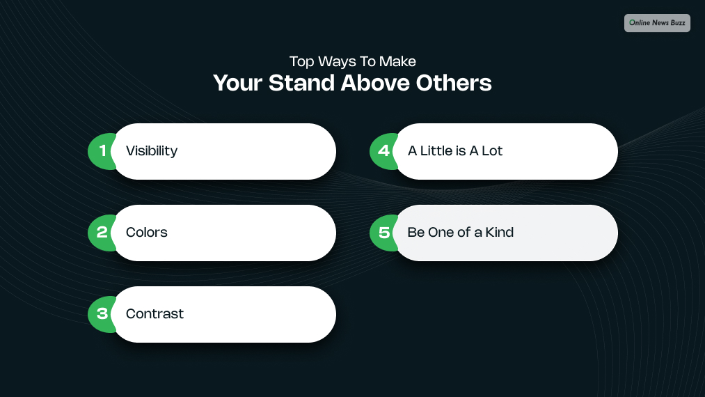
Top Ways To Make Your Stand Above Others

If you are planning to create your own signage, then you might want to make it stand among other signs. So, here are some ways to make sure you’re signage stands above the competition:
Visibility:
You’ve probably heard the single most important thing in real estate is location. Hell, they say three times for crying out loud. And it turns out that location is the number one factor for signage as well. Find a place to put your sign that is going to be seen by most people. You may even want to place your sign a bit higher than the buildings around you so it can be seen from afar.
There is a reason McDonald’s places its sign above everything else around it. Visibility!
Colors:
Did you know that studies have illustrated that roughly 80% of people recognize businesses by color? And why is that? Our eyes have been evolutionarily hard-wired to be drawn to colors. It’s in our DNA. Harness the power of that DNA, and get eyes on your signage.
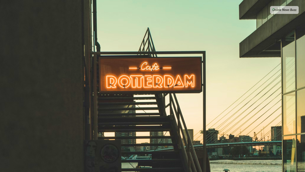
A great way to implement colors is with neon signs. Not only do they stand out above the rest. But it also doubles as a piece of art. And art is a great way to sell your brand, and selling your brand is what gets you paid.
Contrast:
For even better logo recognition, pick two colors that contrast well together. This is a trick that’s been known for centuries. Two colors are better than one. Don’t believe us? Then think of your favorite sports teams. What does every one of them have in common? They’ve all got two main colors. The Packers are green and white; the lakers are purple and gold. A great combination of colors provides extra contrast to your sign adding a whole other level of awesomeness to its design.
This color contrast doesn’t just make it easy to see what the sign says, but it adds ‘visual interest’ establishing a clear focal point of the sign. That focal point is your opportunity to (metaphorically) smack customers in the mouth with how wondrous your product is.
A Little is A Lot:
Keep your sign free of clutter. Give all the information that people will need, but be concise. Giving too much information on a sign runs the risk of messing with the flow of the design. But worse than that, you run the risk of information overload. The less amount of information you put on the sign, the more likely it is that people are going to absorb the information you need them to latch onto.
Be One of a Kind:
If you want your sign to stand above the arrest, then it can’t look like the rest. Implement a design that pops, use colors that sparkle. Maybe even put a quirk in it that makes it look a little off.
Remember, your sign is a piece of art. And the best art always has flaws in it, that’s what makes it priceless. Look at Picasso, he embraced imperfections, and it’s the reason we remember him today.
Perfection is good and all, but in an era of machine-made well… everything… it’s refreshing to see something with goofy quirks. Be the sign on the block that has one of those quirks, and it will be the one that’s memorable.
It may not attract business the moment it goes up, but you can be sure that people will begin to pour in as time goes on. You just have to capture their imaginations first.
Frequently Asked Questions
Like you, several other netizens have queries about signage, which you might find useful. Keep reading to learn about these queries; if you have similar questions, you can get your answer here.
When you design a signage for your brand, you must consider certain factors like color, size, height, sign placement, and graphics. All these characteristics together create the signature sign for your brand. However, the most important factor is how the sign is designed to protect your brand.
A sign’s main purpose is to send information to its receiver to make a decision. So, you communicate with your customers using your sign. Additionally, a sign can encourage receivers to opt for your service or product.
Good signage is important because it raises awareness about your brand. So, you clearly communicate your business to your audience using your signage. Any business requires visibility to attract customers, so signage provides cost-effective advertising.
The three functions of signage are identity, advertisement, and giving direction. You provide directions using signage so people can act towards your business. Additionally, you get 24-hour advertising using signage for your business. Furthermore, using signage you create a brand identity that the audience identifies.
Read Also:


