


 By Arina Smith
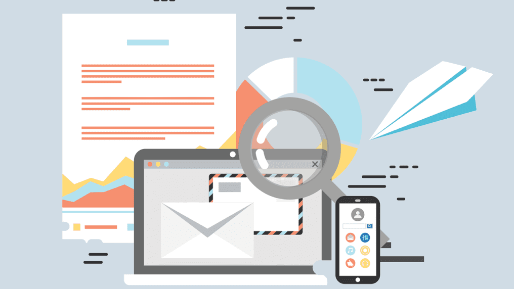
These days we have seen high popularity of smartphones and tablets, which resulted in a mobile revolution. The use of these mobile phones has become much popular throughout the world. These days’ people are found to spending their time as they browse the internet to check their emails from their smartphones. In fact, people prefer to use their smartphones more than their laptops or desktops. F
How should the email look and sound?
You will find that people get greeted with different types of business emails on a regular basis, which either asks people to buy a certain product or get updates which are about certain products. If customers receive your emails, which are otherwise visually appealing, on their smartphones, then they must be able to view these emails without any hindrance. Using a responsive template can help you create such flawless emails. You must use responsive email templates because these will open on smartphones easily and would not compromise on any of its contents. Responsive email templates will understand the specific dimensions of a screen and adjust the mail layout according to manner.
Some of the things which you will have to consider when you are designing the responsive templates are:
- The width of the template must not be over 600 pixels.
- The Pre-header needs to be decided in advance. You should be a bit creative in this respect. You can use the upper left portion of your email templates for depicting the subject matter of the email.
- It would be smart for you to use as few images as you can in the emails you send out because a lot of mail clients would not be displaying your images in a default manner. Hence, this will not compromise on your mail quality.
- You will have to use bold fonts when you want to highlight the headings in order to be able to catch the attention of your client.
- You should use the system fonts more often so that any display error is minimized.
- You must be careful about the specific font sizes which you are using because it can ruin the layout which you have. You should remember to use the 14 points font sizes more often.
- You must not use button sizes, which are lesser than 44 pixels. This will help minimize display errors also.
For more information on email templates, you should search for Designmodo email templates on the internet.
Conclusion
The use of responsive technology will go on to become more popular in the future. It is also accepted that people use their mobile phones to access their emails these days. Hence, it would be absolutely mandatory that a responsive email template is designed more often as it will help people to read their mails while they are using smaller screened devices as well as a smartphone or a tablet. Hopefully, the information mentioned in this article will have helped you. You can subscribe with us for regular updates.
Read Also: